
Moody Vintage White Butterfly Print for Green Decor

Vintage White Butterfly Print for Dark, Moody Green Decor
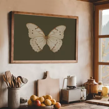
A vintage-style butterfly print brings the quiet drama of natural history illustration into modern interiors. With a pale specimen set against a deep, moody background, it complements green decor, botanicals, antique woods, and matte black accents—ideal for gallery walls, reading nooks, entryways, and plant-filled corners. The effect is equal parts refined and slightly mysterious, like a treasured plate pulled from an old collector’s folio.
What Makes This Butterfly Print Feel Timeless
- Natural history look: The specimen-style composition echoes classic entomology plates and museum displays, giving your walls a curated, archival feel.
- High-contrast mood: A light butterfly against a dark field adds instant depth, letting the artwork stand out without dominating the entire room.
- Works with “green decor”: It pairs naturally with olive, sage, and forest green—especially alongside leafy textures, terracotta pots, and botanical silhouettes.
- Versatile styling: It slips easily into cottagecore, dark academia, modern vintage, and minimalist rooms that need one grounded focal element.
If you’re ready to build that moody, nature-forward look, start with the Vintage White Butterfly Print – Dark Moody Insect Wall Art for Green Decor. Its light-on-dark contrast reads crisp from across the room and still feels detailed up close.
Where It Looks Best at Home
This style of print behaves like a “quiet anchor”—it adds character even in small spaces, and it also holds its own as a centerpiece in more layered rooms.
- Living room: Anchor a gallery wall with one moody insect print, then surround it with softer botanicals or line drawings.
- Bedroom: Place above a nightstand with brass, dark wood, or black frames for a calm, nocturnal feel.
- Entryway: A single butterfly print adds character to small spaces without visual clutter.
- Office or library corner: Complements books, leather textures, and deep wall colors for a “collected over time” finish.
Room-by-Room Styling Ideas
| Space | Best Pairings | Quick Styling Tip |
|---|---|---|
| Living room | Botanical prints, dark wood, linen | Use one larger piece as the center and keep surrounding frames thin and simple. |
| Bedroom | Brass accents, deep greens, soft lighting | Hang at eye level and add a warm bulb for a cozy, moody glow. |
| Entryway | Mirror, narrow console, dried stems | Keep the area minimal so the print reads as intentional, not busy. |
| Office/reading nook | Books, matte black frame, plants | Place near a lamp to create a “cabinet of curiosities” vibe. |
Choosing a Frame and Finish
The frame is where you can steer the print toward modern, antique, or softly rustic—without changing the artwork itself.
- Matte black frame: Sharp, modern contrast that reinforces the dark background and looks especially clean against pale walls.
- Antique gold or brass: Leans into vintage museum energy and warms up cooler greens; it’s a great match for aged mirrors and traditional hardware.
- Natural wood: Softens the mood and suits rustic, cottage, or Scandinavian palettes—particularly if your greens are more sage than forest.
- Matting: A white or warm-cream mat gives the butterfly breathing room and makes the print feel more archival (and a touch more “gallery”).
For a cohesive shelf or console moment, pair your framed print with a small decorative object that repeats the butterfly theme—like the Modern Glass Storage Jar with Golden Butterfly – Elegant Home Decor. The glass-and-gold detail brings a subtle glint that balances moody walls and dark frames.
How to Build a Dark Nature Gallery Wall
A gallery wall in dark, nature-inspired decor works best when it feels deliberate, not crowded. The goal is “curated cabinet,” not “random collage.”
- Start with one “hero” piece: Use the butterfly print as the central anchor, then build outward.
- Add supporting subjects: Botanical sketches, moths, ferns, mushrooms, or vintage maps keep the theme cohesive while varying shapes and textures.
- Repeat one metal tone: Brass or black across frames helps the arrangement feel collected and intentional.
- Keep spacing consistent: Equal gaps between frames read calmer and more refined—especially important when the palette is dark.
- Balance light and dark: Mix in a few lighter pieces or mats so the wall doesn’t become visually heavy.
If you want the arrangement to feel museum-like, consider the way natural history collections are displayed: similar subjects grouped together, clear margins, and a strong focal specimen. For more inspiration on butterflies and their environments, the Smithsonian’s overview of butterfly habitat design is a helpful reference for pairing artwork with living greenery: Smithsonian Gardens: Butterfly Habitat.
Color Pairings for Green Decor
This print shines in green-forward rooms because it bridges organic color with graphic contrast. Think of it as a “night garden” accent—subtle, but memorable.
Care and Placement Tips
For a bit of natural history context (and a reminder of how varied butterfly species can be), the Natural History Museum’s butterfly resources are worth exploring: Natural History Museum (UK): Butterflies.
FAQ
What decor styles pair well with a dark, vintage butterfly print?
It works beautifully with dark academia, cottagecore, modern vintage, and minimalist rooms that need a single high-contrast focal point. It also fits “cabinet of curiosities” styling—especially alongside botanical decor and deep green walls.
Should it be framed with black, gold, or wood?
Black creates a crisp, modern contrast; antique gold or brass adds warm, museum-like vintage character; and natural wood softens the mood for rustic or Scandinavian spaces. A white or warm-cream mat can make any of these options feel more archival.
Where should it be placed for the best effect?
Try it in an entryway, above a console, in a reading nook near a lamp, or above a bedroom nightstand for a calm, nocturnal feel. Avoid harsh direct sun, and use protective glazing if it’s near humidity.













Leave a comment