

Seasonal Color Theory: Build a Capsule That Always Works
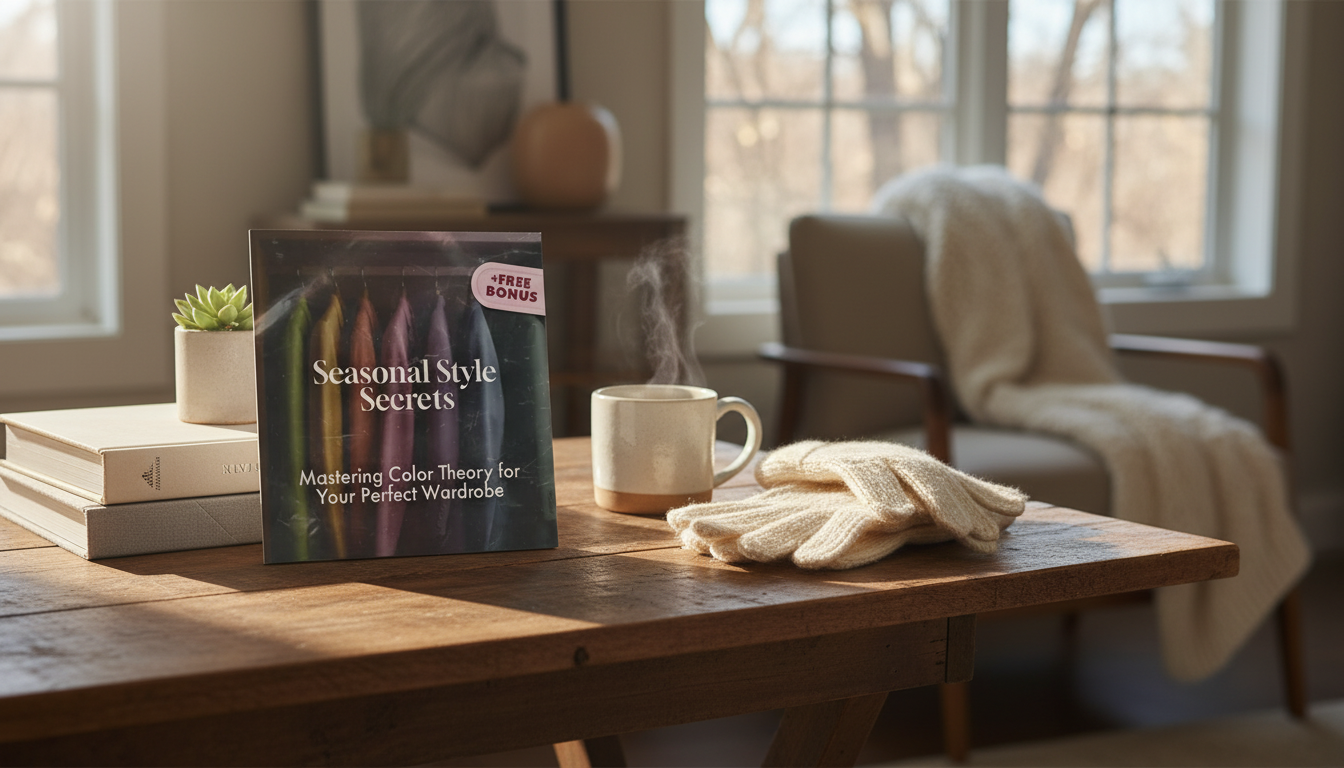
Seasonal Style Secrets: Color Theory That Makes Every Outfit Work Harder
Color does more than “match”—it changes how skin looks, how fabrics feel, and how polished an outfit reads. Seasonal color theory narrows endless options into a palette that supports natural contrast and undertone, making shopping simpler and outfits more consistent across casual and formal looks. Once you know what to look for (temperature, value, and chroma), it becomes easier to spot the shades that make everything else in your closet cooperate.
Why Color Theory Changes the Whole Wardrobe
- Color harmony affects perceived brightness, clarity, and balance near the face—especially in tops, scarves, and accessories where the eye lands first.
- A consistent palette reduces “orphan” items that don’t pair well, helping create more outfits from fewer pieces.
- Seasonal palettes focus on three main levers: temperature (warm/cool), value (light/dark), and chroma (soft/clear).
- Small shifts often create the biggest upgrade—like swapping optic white for cream, or charcoal for warm cocoa.
Color theory has deep roots in art and design, but it’s surprisingly practical for daily dressing. For a quick refresher on the fundamentals, resources like Britannica’s overview of color theory and Pantone’s color education explain why certain combinations feel balanced while others feel “off.”
The Building Blocks: Temperature, Value, and Chroma
- Temperature: warm colors have yellow/golden undertones; cool colors have blue/rosy undertones.
- Value: light vs deep—affects how heavy or airy a look appears, and how much contrast is created with hair/skin.
- Chroma: soft (muted, greyed) vs clear (bright, pure)—controls whether color looks gentle or vivid.
- Neutrals also have temperature and chroma; “neutral” doesn’t automatically mean universally flattering.
Quick Color Traits and What They Tend to Do
| Trait | How it looks | Common wardrobe effect | Easy swap example |
|---|---|---|---|
| Warm temperature | Golden, peachy, earthy | Reads approachable and sunlit | Swap icy pink for salmon |
| Cool temperature | Rosy, blue-based, crisp | Reads clean and refined | Swap camel for cool taupe |
| Light value | Airy, pale, high lift | Softens contrast; feels fresh | Swap espresso for cocoa |
| Deep value | Dark, rich, grounded | Adds drama and structure | Swap pastel navy for inky navy |
| Soft chroma | Dusty, muted, blended | Creates subtle, tonal outfits | Swap bright teal for smoky teal |
| Clear chroma | Bright, saturated, crisp | Adds energy and sharpness | Swap muted coral for poppy coral |
Seasonal Palettes at a Glance (Four-Season Framework)
- Spring: warm + light + clear; often looks best in bright, sunny hues and warm neutrals.
- Summer: cool + light + soft; often suits powdery tones, gentle contrast, and cool-leaning neutrals.
- Autumn: warm + deep + soft; often shines in earthy, rich tones and softened saturation.
- Winter: cool + deep + clear; often supports strong contrast, jewel tones, and crisp neutrals.
- When torn between two seasons, prioritize the most visible trait near the face (clear vs soft, deep vs light).
Think of seasons as “color behavior,” not strict boxes. If one season consistently makes you look well-rested and even-toned, that’s useful data—whether or not the label feels perfect.
Simple At-Home Checks to Narrow Your Season
- Undertone test: compare cream vs optic white near the face in daylight; note which makes skin look more even.
- Metal test: gold vs silver jewelry; note which looks more “belonging” rather than standing out.
- Contrast check: take a photo in natural light; observe how different your hair looks from your skin (low, medium, high contrast).
- Chroma check: hold a muted color and a bright color of the same family near the face; see which reduces shadows and redness.
- Avoid relying on vein color alone; lighting and skin depth can mislead.
A helpful trick: do your comparisons with hair pulled back and minimal makeup, then repeat with your usual look. The best palette often stays consistent, but the “ideal” depth or intensity can shift slightly with hair color, tan level, or makeup contrast.
Building a Capsule Using Seasonal Color Logic
- Choose 2–3 core neutrals that match your temperature (warm—cream, olive, warm navy; cool—charcoal, true navy, cool taupe).
- Pick 3–5 accent colors that match your season’s value and chroma; repeat them across tops, layers, and accessories.
- Use a near-the-face rule: keep most tops within the best palette; skirts/pants can be more flexible.
- Repeat color at least twice (top + shoes, scarf + bag, blouse print + lipstick) to make outfits look intentional.
- Plan for occasions: include one elevated outfit formula, such as tonal monochrome or a structured neutral + a signature accent.
If your closet is currently a mix, start by standardizing your neutrals. When your base (denim, trousers, outerwear, shoes) shares a temperature and depth, the rest of your outfits become mix-and-match by default.
Patterns, Denim, and Prints Without Guesswork
Common Color Mistakes That Make Outfits Feel “Off”
Using the Digital Guide to Make Faster, Better Color Decisions
Little Extras That Support a More Polished Routine
- Elegant Cork Stopper Glass Storage Jar – Transparent Food & Tea Container
- Beautiful Stainless Steel Shell Spoon – Elegant Kitchen Ladle Set
- Stainless Steel Non-Stick Rolling Pin Set for Baking & Kitchen Use
FAQ
Can someone fit between two seasons?
Yes—focus on your dominant traits (temperature, value, and chroma) and choose the season that matches the strongest trait you see near your face. Borrow from the neighboring season by using those colors as accents (bags, earrings, prints) rather than as your main top color.
Do black and white work for every season?
True black and optic white usually look best on high-contrast, clear palettes (often Winter). Many people get a more seamless result from alternatives like charcoal, soft white, cream, espresso, or deep navy, chosen to match their temperature and depth.
How can a seasonal palette still feel personal and not limiting?
Keep it flexible by anchoring with neutrals, then rotating accent colors, textures, and silhouettes to match your style. Signature shades can also live in accessories or makeup, while prints within your palette add variety without breaking outfit harmony.


Leave a comment